Absolute Positioned Image Attached to Paragraph
An image (or other content) can be absolutely positioned with a paragraph.
However the paragraph flows on the web page — wherever it ends up at when published for various devices and browser widths — the image moves with it. The image is always positioned relative to the location of the paragraph.
The technique puts the paragraph and the image within the same div. The div has a CSS position:relative; declaration. The image is within a div positioned with a position:absolute; declaration.
This code does the job:
<div style="position:relative;">
    <p>
      [paragraph content]
    </p>
    <div style="position:absolute; top:-7px; left:-10px;">
      [image]
    </div>
</div>
The div containing the image is positioned relative to the div that also contains the paragraph. The effect is an image attached to the paragraph.
An explanation of how it works and how to implement it is below the examples.
Examples
These examples show a few things that can be done. They are intended for inspiration — to inspire you to think of things you can do with the technique.
Example 1
This first example is the Willmaster website logo on the left of this paragraph of text, 20 pixels from the top and about half of it's width extended beyond the left margin of the paragraph. The paragraph is provided with padding on the left so the logo won't overlap it.
The logo will remain in that position relative to the paragraph, 20 pixels from the top of the paragraph text and half the logo's width into the left margin, however the paragraph displays on the page.
Example 2
This second example is the Willmaster website logo in the same position relative to the paragraph as in the previous example. The div with the image is provided with a CSS z-index:-1; declaration to place it under the paragraph text. The paragraph has no padding on the left.
As before, the logo will remain in that position relative to the paragraph.
Example 3
Now, let's do something fun.
Somewhere in this maze of words there is a mouse. It's an especially elusive mouse. It might not move for minutes, or hours, then scoot! Normal humans can't see it. Cats with sufficient patience might, just might, catch a glimpse of it. How quickly can you pounce?

Note: There is no mouse in there. Yet (although outside the context of this article), a game could be made with a mouse that shows up intermittently and scoots to a new position underneath the paragraph text.
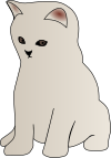
The image of the cat stays in that postion relative to the paragraph no matter how the normal content flows.
How to Do It
Here is the basic code:
<div style="position:relative;">
    <p>
      [paragraph content]
    </p>
    <div style="position:absolute; top:-7px; left:-10px;">
      [image]
    </div>
</div>
Here is how the code works:
First, you have a div with a CSS position:relative; declaration. That declaration is required.
Within the div is text or other content in a paragraph.
Following the paragraph, still within the div, is another div to hold the image. The div that holds the image has these CSS declarations:
-
The CSS
position:absolute;declaration is required to position the image relative to the div with the CSSposition:relative;declaration. -
The CSS
top:-7px;declaration puts the top edge of the image div exactly 7 pixels above the top edge of the div with the CSSposition:relative;declaration.The first two examples have this exact
-7px;value. The third example has a-50px;value. (See The Code for the Examples further below.)For your implementation, adjust the value to place the image exactly where you want it.
-
The CSS
left:-10px;declaration puts the left edge of the image div exactly 10 pixels left of the left edge of the div with the CSSposition:relative;declaration.The first two examples have this exact
left:-10px;declaration. The third example has aright:-25px;declaration.For your implementation, adjust the edge (see the following paragraph) and value to place the image exactly where you want it.
Positioning can also be done with the bottom instead of the top CSS property. Or right instead of left.
The Code for the Examples
The example code can be used as information and also modified to see how things change.
To omit potentially distracting information, the example code has [content] in place of the paragraph content used in the above examples.
Only the code pertinent to the specific example is commented upon.
The code for example 1
Here is the code for the first example.
<div style="position:relative;">
    <p style="padding-left:30px;">
      [content]
    </p>
    <div style=position:absolute; left:-25px; top:20px;">
      <img src="https://www.willmaster.com/images/wmlogo_icon.gif">
    </div>
</div>
The content is padded on the left with a padding-left:30px; CSS declaration so the part of the logo within the margin won't obscure the content.
The logo is positioned with left:-25px; top:25px; CSS declarations.
The code for example 2
Here is the code for the second example, where part of the logo is underneath the content.
<div style="position:relative;">
    <p>
      [content]
    </p>
    <div style=position:absolute; left:-25px; top:20px; z-index:-1;">
      <img src="https://www.willmaster.com/images/wmlogo_icon.gif">
    </div>
</div>
The div with the logo has a CSS z-index:-1; declaration to place it underneath the paragraph content.
The content in this case has no left padding. Instead, it flows over the part of the logo that remains within the margin.
The code for example 3
Now, here is that fun example. As you look at the code, it is quite similar to the previous one.
<div style="position:relative;">
    <p style="background-color:rgba(111,111,111,.2); padding:.5em; border-radius:.5em;">
      [content]
    </p>
    <div style=position:absolute; right:-25px; top:-50px; z-index:-1;">
      <img src="https://www.willmaster.com/images/cat.png">
    </div>
</div>
The difference between the previous code and this one is in the location of the absolutely positioned content, the image of the cat.
The image of the cat is positioned with right:-25px; top:-50px; CSS declarations. It places the cat right where we want it, on the right and overlooking the content.
(This article first appeared with an issue of the Possibilities newsletter.)
Will Bontrager


